

Adding some ‘flex’ to a global wealth manager
Barclays Private Bank needed a new ‘flex-brand’ to help differentiate themselves from their colourful main brand. Something that was serious but not stuffy – aimed at their high-wealth customer base.
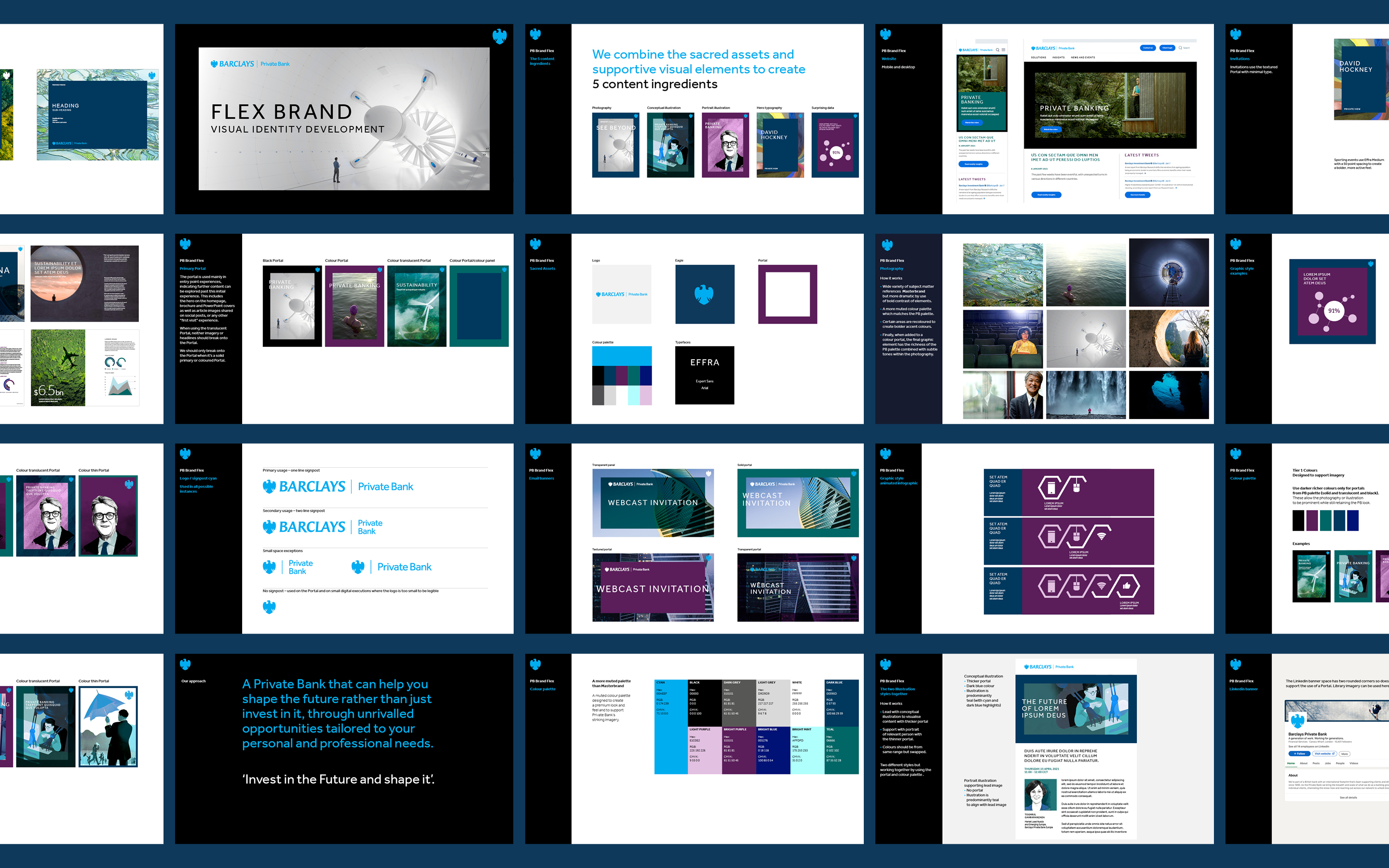
By looking through their extensive existing guidelines, a muted palette with occasional brighter colour accents was selected, with colour pairs created. New photography, infographic and illustration guidelines were developed, giving us a restrained, premium feel and finally framing things in the portal device.
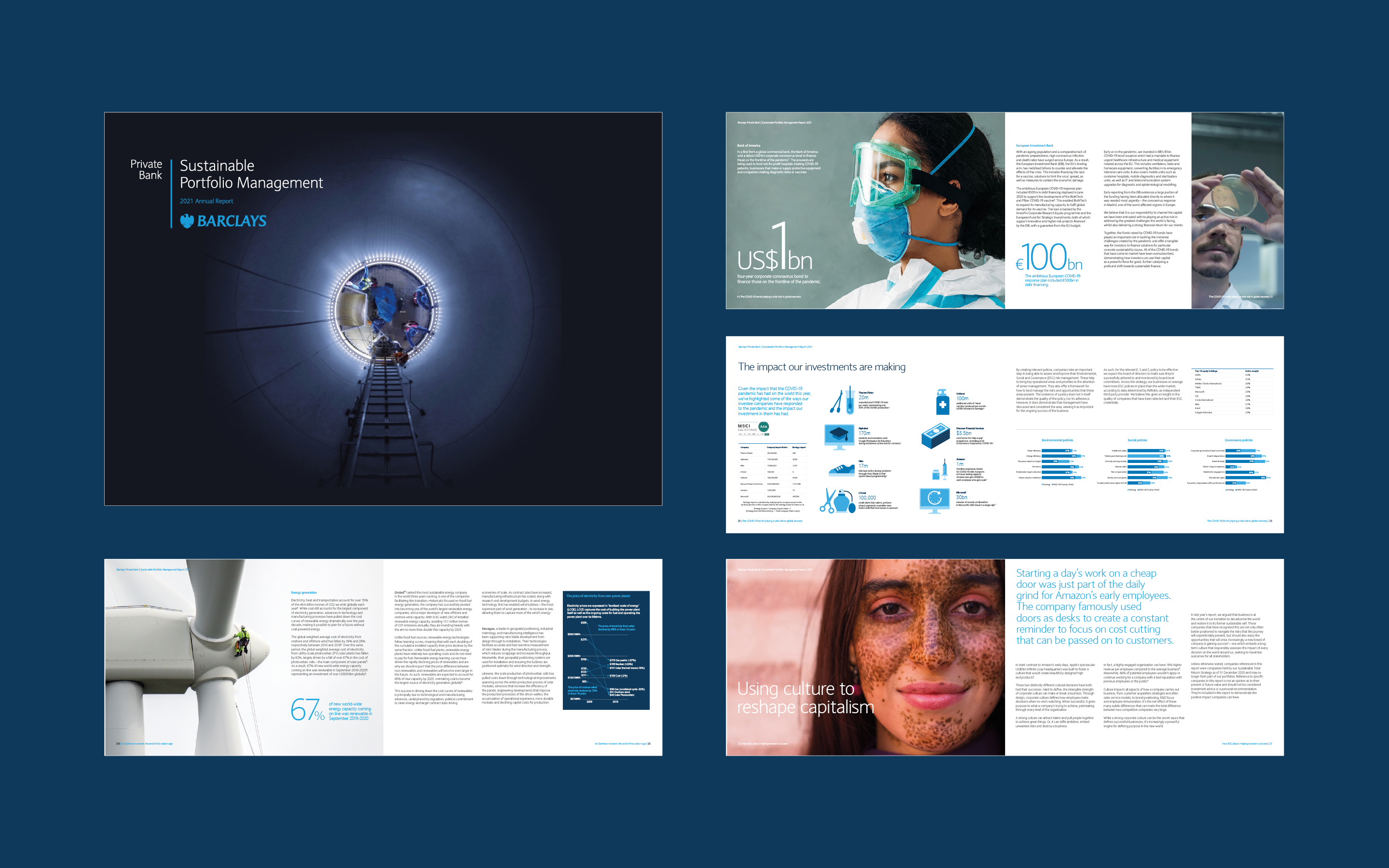
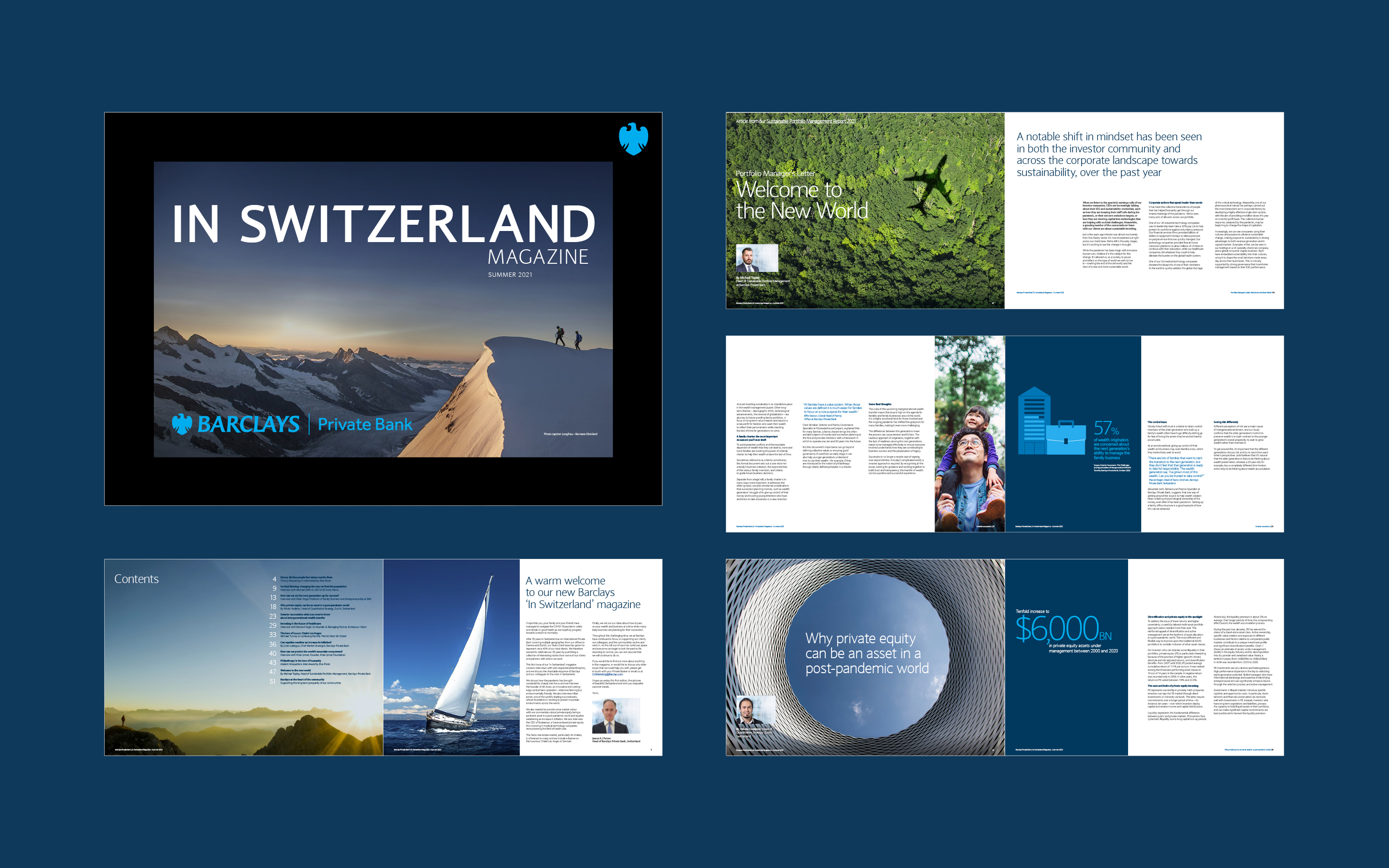
What began as a relatively small project, through research and development with the client and invaluable team members, became a thorough 60-page set of guidelines to help elevate this premium brand.
The Flex brand Guidelines
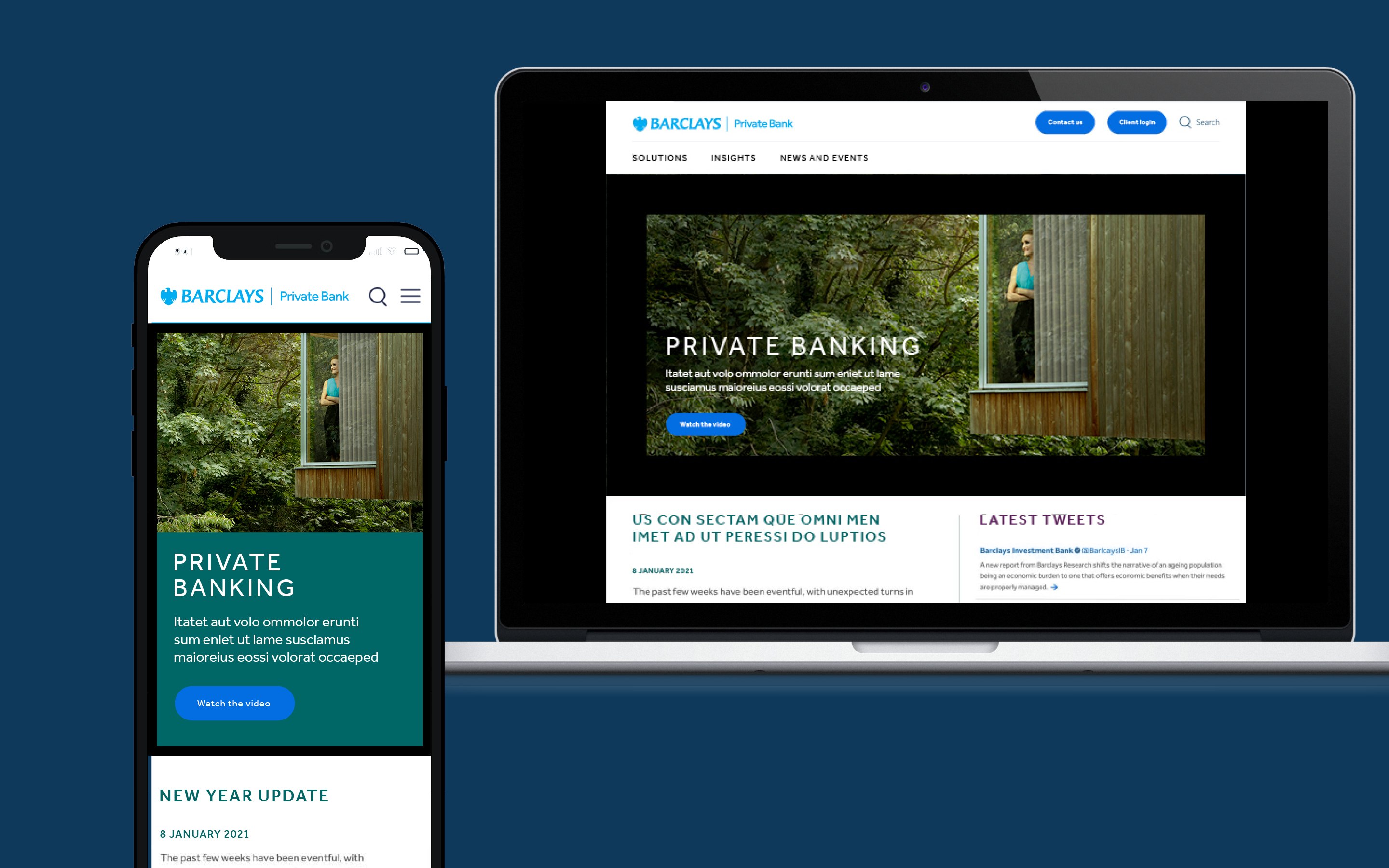
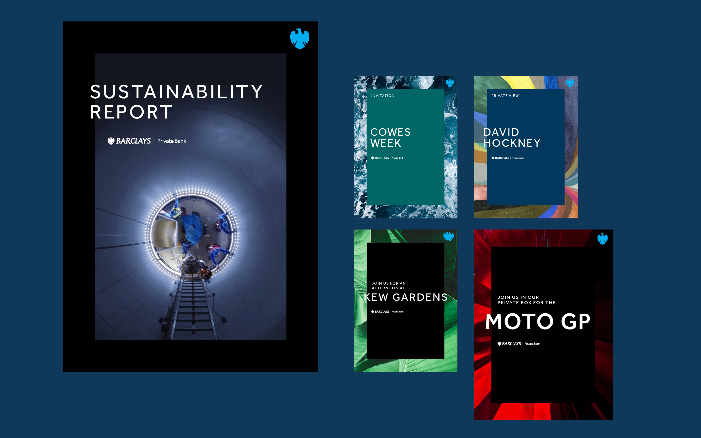
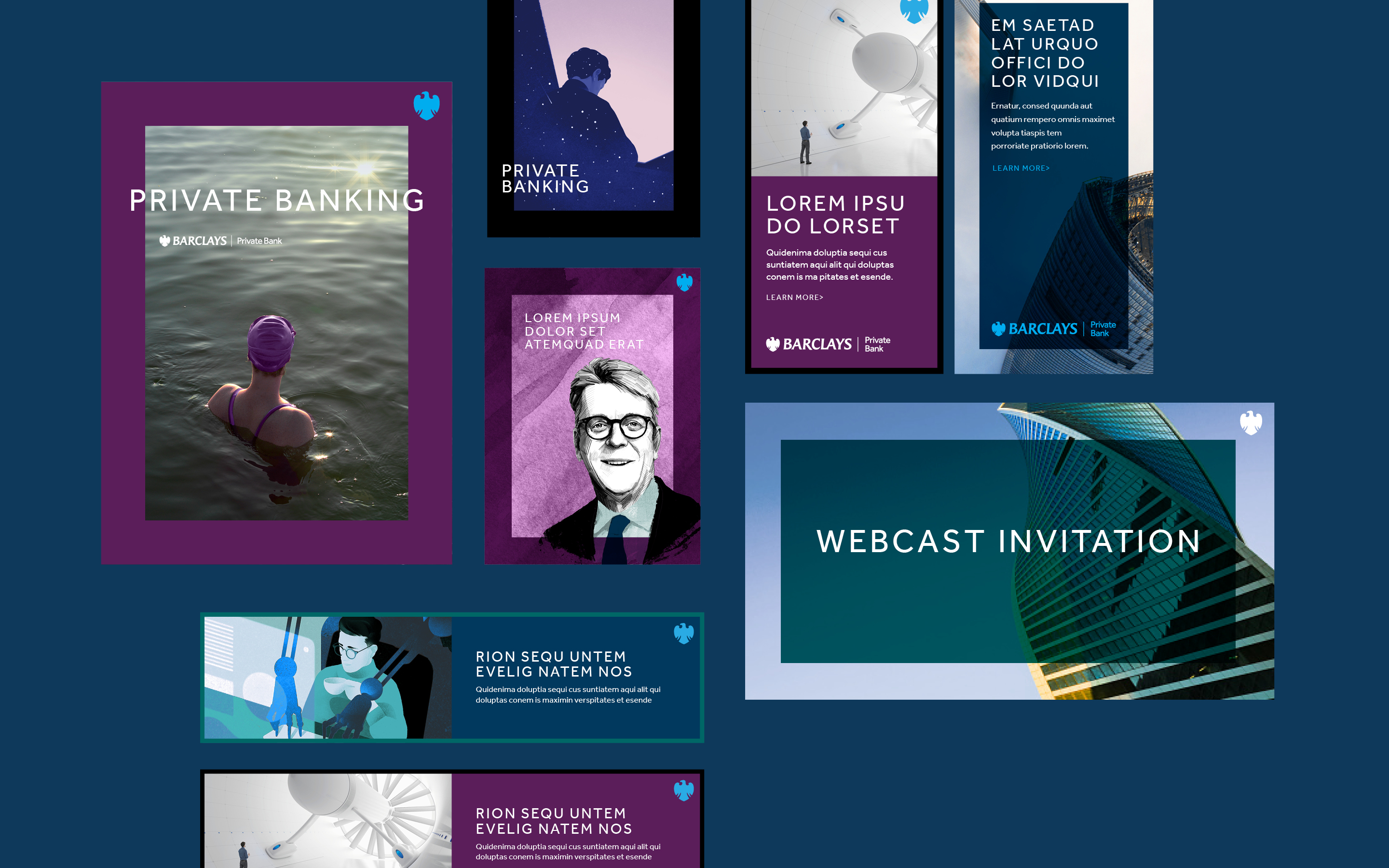
Applied to Brochures
… and an infographic video explaining the rise of Green billionaires